The 7 Colours Everyone Will Be Wearing in 2022, According to Pantone
Spring is finally just around the corner, and sartorially speaking, there is plenty to look forward to. Today, we'll be honing in on one of our favourite subjects, colours, and which hues are going to bring us the most excitement for the season ahead. While we already did our own report according to what we saw in the S/S 22 collections, this time, we looked to the colour experts at Pantone for even further insight. The Pantone Color Institute could be deemed as the colour-trend authority, so when it released its fashion week colour report, we had to share.
A majority of the shades for 2022 are eye-catching and saturated, while there are a few understated options in the mix like Orchid Bloom and Humus. Below, find seven Pantone colours that you can expect to see everywhere this spring. Keep scrolling to shop our favourite picks in each hue. We guarantee you'll find something that you'll want to add to your cart immediately.
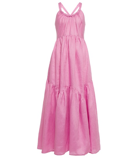
1. BUBBLEGUM

Photo:
Courtesy of Anna Sui; AltuzarraWhen spring comes along, I'm not surprised when I see a plethora of pink on the market. Instead of a bright fuchsia or pastel, Bubblegum is the perfect middle ground. The shade comes and goes out of the spotlight, and according to Pantone, it's back and ready for action.
2. FRAGILE SPROUT

Photo:
Courtesy of Christian Siriano; VersaceWhile kelly green has been reigning in populairty and will continue to do so for 2022, the spring runways proved that there's also room for a more electric lime green. Pantone seems to agree, as it had the shade Fragile Sprout in its colour report.

Photo:
Courtesy of Altuzarra; NanushkaWhile Pantone did mark Very Peri as the colour of the year, it was a lighter purple that showed up in its fashion week colour report. It's a breath of fresh air that balances things out from the rest of the bright hues in this mix.
4. POINCIANA

Photo:
Courtesy of Proenza Schouler; Alltuzarra; Bottega VenetaNot only was this fiery shade of red spotted on the runways of Proenza Schouler and Atluzarra, but it has been recently championed by celebrities like Rihanna and Kate Middleton.
5. HUMUS

Photo:
Courtesy of Bottega Veneta; Miu Miu; Maryam Nasir ZadehHumus is the king of all neutrals, as it's a cooling taupe that will pair well with just about anything.

Photo:
Courtesy of Blumarine; Christopher EsberWe like to call Popcorn a "no-colour colour," as it still has colour but is light enough to be paired like a neutral.
7. CORAL ROSE

Photo:
Courtesy of Staud; Proenza SchoulerA sister shade to Poinciana, Coral Rose is both comforting and playful at the same time. We already predicted to see a lot more orange this year, so we're not surprised this showed up on Pantone's report.
- Explore More:
- Spring/Summer 2022 Trends


